Capsule
Onboarding Improvements with User Interviews and Usability Testing
User Interviews I Customer Onboarding I Order Conversion
An Onboarding Catch-22
You’re watching Hulu and see an ad for a new digital pharmacy, Capsule. You loathe your current experience at Walgreen’s and want to try something new.
You assume Capsule is like any digital service, and go online to create an account. This way you know all of your information is in the system prior to your next doctor’s appointment. Yet, when you go to the Capsule website you find that you can only create an account if you already have a prescription. It’s a catch-22, you want to create an account before you actually get a prescription from the doctor, but can’t create an account if you don’t have a prescription.
This is what many Capsule users encountered when they went to Capsule’s website and clicked “get started”, so we sought to fix this…
After discovering that onboarding conversion rates were low, the Capsule Product team ran a quick survey learning that users’s were confused about how to sign up for Capsule.
I was then brought on to the project to understand the onboarding user personas and motivations and later on to validate initial designs.
This work paved the way to improve the user’s onboarding experience to align with their existing mental models and behaviors.
This research had two main components:
Generative Discovery
Initial problem discovery research on customer personas.
Usability Testing
Diving deeper into usability to improve designs that performed poorly in initial A/B testing.
Generative Discovery
Problem
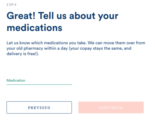
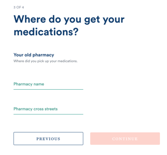
Capsule’s old onboarding process was built for customers to transfer existing prescriptions at other pharmacies into Capsule. The onboarding process was a step-wise form that could only be filled out if a customer had existing prescriptions to be filled.
A previous survey to this work had uncovered that there were customers who were looking to “get started” at Capsule did not have any medications to send from another pharmacy, and instead either didn’t yet have any prescriptions or had new prescriptions sent over via e-script from their doctor. The Product team wanted to understand this behavior among potential users to build a personalized onboarding process that met their needs and increased conversion among these cohorts.
Research Objectives
Understand why these two types of cohorts want to create accounts with Capsule.
Understand the existing mental models among these cohorts for how to get started with Capsule.
Methods
Individual user interviews were conducted with 19 customers using a moderated script to understand the two key onboarding cohorts:
Customers without prescriptions.
Customers who already sent in prescriptions from their doctor.
Findings
The users in each cohort shared a few similar motivations:
Information finding. Users in both cohorts signed up with Capsule to find more specific information than was available on the logged-out website, (information on specific medications, more detailed information on Capsule’s prices, information on insurance and pricing).
Vetting Capsule. Users in both cohorts signed up with Capsule to vet Capsule as legitimate.
Capsule “How to” Confusion. A few users in both cohorts thought that signing up was required as a part of the Capsule process.
Yet there were some key motivation differences as well:
Customers without prescriptions were looking into Capsule prior to a doctor’s appointment and were motivated to set up an account with Capsule to share important information ahead of time to avoid potential mishaps, delivery issues or delays.
Customers who already sent in prescriptions from their doctor were introduced to Capsule in their doctor’s office and were motivated to set up an account with Capsule because they didn’t understand what happens after their e-script is sent from the doctor.
Impact
Pricing. Customers also had questions around pricing and wanted a way to vet Capsule (ie. Free delivery? What’s the catch?) that were not addressed in the more detailed logged-in account FAQs. Since these questions popped up across cohorts, this work gave rise to the idea of a separate pricing page on the logged-out website (See Case Study #2, “How past research informed website updates to elicit trust among customers” for more) .
Onboarding Flow. Since motivations differed among the cohorts, the team decided to create a trifurcated onboarding approach. Though the customers all saw the same account information once signed in, this approach allowed the team to bucket customers into three groups for future marketing initiatives. The new onboarding designs were tested with poor results. Although the new onboarding was slightly better at driving sign-ups it drove down order conversion, prescriptions transferred in and showed no lift in account conversion. In order to understand the issue with the new design, usability testing was conducted on the new onboarding process.
Usability Testing
Problem
The initial design from generative research performed poorly in A/B tests. The flawed designs were then tested with actual users to understand the usability of the new design and pinpoint issues with the current process.
Hypotheses
Customers were confused by the options in the onboarding flow.
The logged-in accounts did not have the right information to convince customers to convert.
We underestimated how long it would take customers with accounts to send in new medications.
Methods
5 customers from the two cohorts walked us through the new design experience with the original trifurcated design. This research allowed us to understand what aspects of the design led to poor performance during A/B testing.
Insights
Content. The new set of onboarding options confused customers, especially the options to “sign up without a prescription” and “fill the prescription my doctor sent to Capsule”. The confusion came from poor content where users did not understand 1)what it meant to be “with/without a prescription” and 2) what kind of “situation” would entail that a doctor had already sent in a prescription.
Detailed FAQs. Customers wanted more information available once they access their account. They wanted to understand insurance/pricing, information on their doctors, and more detailed FAQs about medications, inventory, and regulations.
Non-prescribed accounts. There will be a subset of customers who take a long time to send because they have nothing to fill, they were just curious about creating an account. These customers can be targeted through marketing.
Impact
The Product team used the feedback to update and simplify the design and copy for the trifurcated options for customers. With too much cognitive overload to choose between three options, instead, customers were only given two answers at a time to filter them into the correct cohort.
Based on the feedback from customers, a few different variations were considered. The chosen variation (variation 3) for the new onboarding flow showed a notable increase in web-to-order conversion and additional accounts created.


